
原文链接:https://www.mk2048.com/blog/blog.php?id=000iac1hj&title=iconfont字体图标和各种CSS小图标
前言:这是笔者学习之后自己的理解与整理。如果有错误或者疑问的地方,请大家指正,我会持续更新!
iconfont字体图标
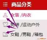
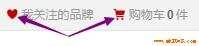
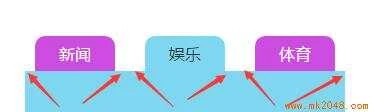
我们的需求中,很多时候会看到一些小的图形,或者叫图标,比如天猫网站中:
这些小图形我们可以用图片代替,通常我们是把这些图形切图之后做成精灵图(又叫雪碧图);
精灵图的原理:把很多小图片集合成一张大图片,然后用设置背景图的位置来显示图片;
精灵图的优点:减少服务器的请求次数,降低服务器压力;
sprites是一款很好的精灵图制作工具;
当然还有其他的方法可以制作这些小的图形,比如上图中,天猫使用的字体图标iconfont;
字体图标,顾名思义,就是一种字体,和字体一样,是矢量的,我们也叫矢量图标,任意放大缩小,都不会失真;
网络中有很多字体图标库,这里我介绍一下iconfont的使用:
我就不说怎么制作了,我们直接使用吧(呵呵,其实我画的图太丑);
原本准备写一下使用方法的,但是iconfont好像又升级了,加入了symbol写法,支持多色图标了(这涉及到SVG的知识),官网的帮助文档的GIF图也很好的解释了怎么应用,我就写一下我第一次用的时候遇到过的坑吧:
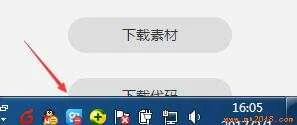
"下载代码"按钮,希望你能直接找到。嗯,我找了好一会,默认让我去设置颜色和大小去了,这个是去弄素材的,前端只要代码就可以了,点击撤销,然后...;
不知道是我电脑问题(1366*768)还是怎么回事?这个"下载代码"按钮被我的windows底部工具栏挡住了一半,嗯,这个...
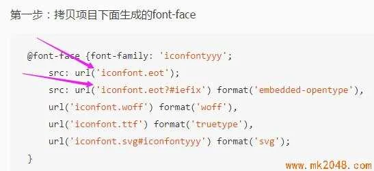
当我们把字体图标下载下来之后,它就是一个文件了,我们是在css里定义字体类型的时候,别忘了把路径设置正确;
如果我们使用的是iconfont的在线项目(没有下载文件),当项目成员更新了图标,如果我们也想用新的图标,就也得更新"在线链接";
字体不支持多色,如果我们使用下载文件的方式,那就只能用字体颜色设置单色了。想使用多色图标,就得用symbol引用在线链接的方式;symbol引用的是js文件,font-class引用的css文件,两种方式的写法也是不一样的;
CSS小图标
大师们用css制作出了各种纯css图形,我这里就只列举几种我用的比较多的;
三角形
菜单(三道杠)
用border上边框双线和下边框实线,也可以反着来:

代码如下:


*{
padding: 0;
margin: 0;
}
.menu{
margin: 100px;
width: 55px;
height: 10px;
border-top: 30px double #f00;
border-bottom: 10px solid #f00;
/*用border上边框双线和下边框实线,也可以反着来*/
}
View Code
内凹角
大师的方法,点击这里,用css3属性径向渐变radial-gradient做:
背景图径向渐变可以设置:圆心位置,渐变的大小,渐变的形状,圆心处的颜色 宽度, ... ,结尾处的颜色宽度;

代码如下:
*{padding: 0;margin: 0;}
a{text-decoration: none;cursor: pointer;}
li{list-style: none;}
/*清除浮动*/
.clearfix:before, /*:before处理margin上下重叠*/
.clearfix:after {
content: "";
display: table;
}
.clearfix:after {
clear: both;
}
.clearfix {
zoom: 1;
}
.test{
margin: 100px 0 0 100px ;
}
.list{
margin-left: -20px;
}
.content{
width: 320px;
background: #7fd6f1;
min-height: 200px;
}
.item .active{
background: #7fd6f1;
color: #333;
}
.item{
float: left;
margin-left: 30px;
}
.item a{
display: block;
background: #ce4be2;
width: 80px;
height: 35px;
text-align: center;
line-height: 35px;
color: #fff;
border-radius: 10px 10px 0 0;
position: relative;
}
.item a:after{
content: "";
display: block;
position: absolute;
right: -9px;
/*不知大家是否发现,在边缘处其实是有1px的变化的,弧度到最后不是很自然,这里我们其实可以把位置往里1px*/
bottom: 0;
width: 10px;
height: 10px;
background: -webkit-radial-gradient(100% 0%, farthest-side, transparent 0%, transparent 8px, transparent 9px, #ce4be2 100%);
background: -o-radial-gradient(100% 0%, farthest-side, transparent 0%, transparent 8px, transparent 9px, #ce4be2 100%);
background: -moz-radial-gradient(100% 0%, farthest-side, transparent 0%, transparent 8px, transparent 9px, #ce4be2 100%);
background: radial-gradient(100% 0%, farthest-side, transparent 0%, transparent 8px, transparent 9px, #ce4be2 100%);
/*背景图径向渐变可以设置:圆心位置,渐变的大小,渐变的形状,圆心处的颜色 宽度, ... ,结尾处的颜色宽度*/
/*圆心位置默认为center,我们这里设置圆心为元素左顶点和右顶点*/
/*渐变的大小默认为farthest-corder ,我们这里设置的farthest-side*/
/*渐变的形状默认为ellipse(椭圆),我们这里得设置成circle(圆形),但是宽高一样的椭圆不就是圆形么,so...*/
/*颜色和宽度的设置,我们在离元素宽度还有1px的时候变化,所以这里是10-1=9px;*/
}
.item a:before{
content: "";
display: block;
position: absolute;
left: -9px;
bottom: 0;
width: 10px;
height: 10px;
background: -webkit-radial-gradient(0% 0%, farthest-side, transparent 0%, transparent 8px, transparent 9px, #ce4be2 100%);
background: -o-radial-gradient(0% 0%, farthest-side, transparent 0%, transparent 8px, transparent 9px, #ce4be2 100%);
background: -moz-radial-gradient(0% 0%, farthest-side, transparent 0%, transparent 8px, transparent 9px, #ce4be2 100%);
background: radial-gradient(0% 0%, farthest-side, transparent 0%, transparent 8px, transparent 9px, #ce4be2 100%);
}
.item .active:after{
background: -webkit-radial-gradient(100% 0%, farthest-side, transparent 0%, transparent 8px, transparent 9px, #7fd6f1 100%);
background: -o-radial-gradient(100% 0%, farthest-side, transparent 0%, transparent 8px, transparent 9px, #7fd6f1 100%);
background: -moz-radial-gradient(100% 0%, farthest-side, transparent 0%, transparent 8px, transparent 9px, #7fd6f1 100%);
background: radial-gradient(100% 0%, farthest-side, transparent 0%, transparent 8px, transparent 9px, #7fd6f1 100%);
}
.item .active:before{
background: -webkit-radial-gradient(0% 0%, farthest-side, transparent 0%, transparent 8px, transparent 9px, #7fd6f1 100%);
background: -o-radial-gradient(0% 0%, farthest-side, transparent 0%, transparent 8px, transparent 9px, #7fd6f1 100%);
background: -moz-radial-gradient(0% 0%, farthest-side, transparent 0%, transparent 8px, transparent 9px, #7fd6f1 100%);
background: radial-gradient(0% 0%, farthest-side, transparent 0%, transparent 8px, transparent 9px, #7fd6f1 100%);
}
View Code
桃心
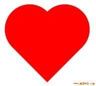
代码如下:
/{padding: 0;margin: 0;}*/
.wrapper{
margin: 100px;
width: 300px;
height: 300px;
border: 1px solid #0ff;
}
.test{
display:inline-block;
margin:50px;
height: 100px;
width: 100px;
background-color: red;
transform: rotate(-45deg);
}
.test::before , .test::after{
display:block;
content:"";
width: 100px;
height: 100px;
background-color: red;
border-radius: 50%;
margin-top:-50%;
}
.test:after{
margin-left:50%;
}
View Code
回到顶部

*{padding: 0;margin: 0;}
.goTop{
position:fixed;
right:10px;
bottom: 10px;
height:50px;
width: 50px;
text-align:center;
background-color: lightblue;
border-radius: 20%;
overflow: hidden;
}
.goTop:hover:before{
top:50%;
}
.goTop:hover .directTop{
visibility: hidden;
}
.goTop:before{
position: absolute;
top: -50%;
left: 50%;
transform: translate(-50%,-50%);
content:'回到顶部';
width: 40px;
color:peru;
font-weight:bold;
}
.directTop{
visibility: visible;
display:inline-block;
margin-top: 20px;
height:20px;
width: 20px;
border: 3px solid;
border-color: white transparent transparent white;
transform:rotate(45deg);
}
View Code
还有很多css制作的经典图形,以后再整理吧;
其实,css制作的图标和图片代替的图片都很棒,根据需求吧。我更喜欢字体图标和图片的方式,效率更高,简单。
来源:https://www.icode9.com/content-4-449851.html
到此这篇字体图标大全(字体图标大全图片)的文章就介绍到这了,更多相关内容请继续浏览下面的相关推荐文章,希望大家都能在编程的领域有一番成就!版权声明:
本文来自互联网用户投稿,该文观点仅代表作者本人,不代表本站立场。本站仅提供信息存储空间服务,不拥有所有权,不承担相关法律责任。
如若内容造成侵权、违法违规、事实不符,请将相关资料发送至xkadmin@xkablog.com进行投诉反馈,一经查实,立即处理!
转载请注明出处,原文链接:https://www.xkablog.com/kjbd-jg/21051.html