
基于element-ui封装组件库,我想要实现的效果是:
开发者想要正常使用element的普通组件时,可以正常按需引入,正常使用。 另外想要使用本组件库二次封装的组件时,也能按需引入使用。 接着之前的文章,现在开始二次封装一个element的dialog组件。我希望它能有默认的头部和底部。并且使用方法和element-ui的dialog一样。
一,二次封装Dialog:
先写package/Dialog/index.js,为按需引入做准备:
// 导入组件,组件必须声明 name import BiuDialog from "./src"; // 为组件提供 install 安装方法,供按需引入 BiuDialog.install = function (Vue) {
    Vue.component(BiuDialog.name, BiuDialog); }; // 导出组件 export default BiuDialog;
然后编写dialog组件的封装代码:package/Dialog/src/index.vue:
<template> <div class="biu-dialog-box"> <el-dialog :custom-class="customClass" :title="$slots.title ? '' : title" :visible.sync="show" :width="width" :top="top" :append-to-body="appendToBody" :modal="modal" :fullscreen="fullscreen" :destroy-on-close="destroyOnClose" :modal-append-to-body="modalAppendToBody" :before-close="beforeClose" :close-on-click-modal="closeOnClickModal" :show-close="false" @open="open" @opened="opened" @close="close" @closed="closed" > <!-- 有写弹窗头部则采用输入的 --> <template v-if="$slots.title"> <span slot="title"> <slot name="title" /> </span> </template> <!-- 自定义默认头部 --> <template v-if="!$slots.title"> <div slot="title" class="biu-default-header-box"> <div class="biu-default-header-title">{
  { title }}</div> <div class="biu-default-header-close" @click="beforeClose2" v-if="showClose" > <span class="biu-icon-guanbi2"></span> </div> </div> </template> <!-- 弹窗内容区域 --> <slot /> <!-- 弹窗底部区域 --> <template v-if="$slots.footer"> <span slot="footer"> <slot name="footer" /> </span> </template> <!-- 自定义默认头部 --> <template v-if="!$slots.footer"> <div slot="footer" class="biu-default-header-box"> <el-button class="btn" @click="cancel">取消</el-button> <el-button class="btn sure" @click="submit">确定</el-button> </div> </template> </el-dialog> </div> </template> <script> //没有输入slot=title的时候,就使用自定义的shot=title export default {
      name: "biuDialog", props: {
      visible: {
      type: Boolean, default: false, }, title: {
      type: String, default: "提示", }, appendToBody: {
      // Dialog 自身是否插入至 body 元素上。嵌套的 Dialog 必须指定该属性并赋值为 true type: Boolean, default: true, }, modalAppendToBody: {
      // 遮罩层是否插入至 body 元素上,若为 false,则遮罩层会插入至 Dialog 的父元素上 type: Boolean, default: true, }, modal: {
      // 是否需要遮罩层 type: Boolean, default: true, }, fullscreen: {
      // 是否全屏 type: Boolean, default: false, }, destroyOnClose: {
      // 关闭时销毁 Dialog 中的元素 type: Boolean, default: true, }, width: {
      type: String, default: "30%", }, top: {
      type: String, default: "15vh", }, customClass: {
      type: String, default: "biu-dialog", }, showClose: {
      type: Boolean, default: false, }, closeOnClickModal: {
      type: Boolean, default: true, }, beforeClose: {
      type: Function, }, }, computed: {
      show: {
      get() {
      return this.visible; }, set(val) {
      console.log(val); this.$emit("update:visible", val); // visible 改变的时候通知父组件 }, }, }, data() {
      return {
     }; }, methods: {
      //点击自定义的关闭按钮 beforeClose2() {
      this.beforeClose(() => {
      this.show = false; }); }, open() {
      // Dialog 打开的回调 this.$emit("open"); }, opened() {
      // Dialog 打开动画结束时的回调 this.$emit("opened"); }, close() {
      // Dialog 关闭的回调 this.$emit("close"); }, closed() {
      // Dialog 关闭动画结束时的回调 this.$emit("closed"); }, cancel() {
      this.$emit("cancel"); }, submit() {
      this.$emit("submit"); }, }, }; </script> <style scoped lang="scss"> :deep(.el-dialog) {
      min-width: 320px; .el-dialog__header {
      padding: 0; color: #d37332; font-weight: 500; height: 50px; display: flex; flex-direction: column; justify-content: center; border-bottom: 2px solid #e9e8e8; font-size: 14px; .biu-default-header-box {
      padding: 0 20px; display: flex; line-height: 20px; .biu-default-header-title {
      flex: 1; } .biu-default-header-close {
      width: 15px; height: 15px; } } } .el-dialog__footer {
      padding: 0; text-align: center; height: 88px; border-top: 2px solid #e9e8e8; display: flex; justify-content: center; flex-direction: column; .btn {
      width: 120px; height: 40px; background: #e9e8e8; border-radius: 2px; } .sure {
      color: #ffffff; background: #de9a6c; margin-left: 66px; } } } </style>
二,封装的注意点
1,无需变化的props的透传
参考element的dialog的props,因为封装后,我希望开发者照着element的文档也能开发,而不需要额外的学习,所以一些不需要变更的props可以透传出来:
<el-dialog :width="width" :top="top" > </el-dialog> props: {
width: {
type: String, default: "30%", }, top: {
type: String, default: "15vh", }, }, 这样子,使用组件时就可以和element的dialog一样,使用width和top属性:
<biu-dialog :visible.sync="dialogshow" title="标题" width="800px" top="100px" ></biu-dialog> 2,visible属性的处理
在element的文档中,这个属性是这样用的:
:visible.sync="show" 也就是dialog组件内部修改了传入的visible属性时,会直接触发更新父组件的show的值(这里用show命名是为了避免命名重复)
而我们使用biu-dialog组件的时候,按照element文档,也是需要属性绑定传值的,为了保持一致,就不能使用props(单向数据流,不修改父组件的dialogshow属性),而是应该用computed做一层代理:
computed: {
    show: {
    get() {
    return this.visible; }, set(val) {
    console.log(val); this.$emit("update:visible", val); // visible 改变的时候通知父组件 }, }, },
然后父组件的使用:
<biu-dialog :visible.sync="dialogshow" ></biu-dialog> this.$emit(“update:visible”, val)会直接变更dialogshow的值。
这样biu-dialog中就不需要定义修改dialogshow的函数了。
3,头部使用自定义的头部
 <el-dialog :title="$slots.title ? '' : title" :visible.sync="show" :show-close="false" > <!-- 有写弹窗头部则采用输入的 --> <template v-if="$slots.title"> <span slot="title"> <slot name="title" /> </span> </template> <!-- 自定义默认头部 --> <template v-if="!$slots.title"> <div slot="title" class="biu-default-header-box"> <div class="biu-default-header-title">{
  { title }}</div> <div class="biu-default-header-close" @click="beforeClose2" v-if="showClose" > <span class="biu-icon-guanbi2"></span> </div> </div> </template> <!-- 弹窗内容区域 --> <slot /> </el-dialog>
主要是通过$slots.title判断开发者在使用组件时有没有传入头部插槽组件,没有的话,就采用自定义的头部,底部的话,也是同样的道理。
4,样式的修改
可以注意到的是封装后的弹窗的html:
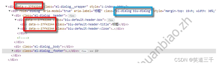
虽然说可以直接修改我们自定义的部分结构的样式,但是如果我们想要修改element组件内置的样式,则需要样式穿透处理一下:
<style scoped lang="scss"> :deep(.el-dialog) {
    min-width: 320px; .el-dialog__header {
    //其他样式 } .el-dialog__footer {
    //其他样式 } } </style>
三,文档的编写
1,文档模块中引入element和我们封装的组件库
这个在之前的文章已经说过,需要在docs/.vuepress/enhanceApp.js文件夹下注册引入组件库:
import ElementUI from 'element-ui'; import 'element-ui/lib/theme-chalk/index.css'; // 导入组件库 import BiuUi from "../../packages/index.js"; export default async ({
     Vue }) => {
    if (typeof process === 'undefined') {
    Vue.use(ElementUI) // 全局注册组件 Vue.use(BiuUi); } }
2,新增dialog文档
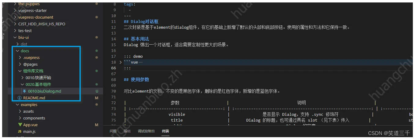
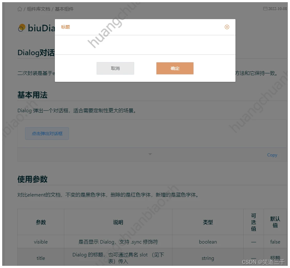
3,文档运行的效果
四,用户的使用
1,全局引入element
npm install element-ui --save--dev 用户在项目代码中需要全局引入element-ui,或者按需引入我们使用到的el-dialog和el-button组件:
import ElementUI from "element-ui"; import "element-ui/lib/theme-chalk/index.css"; Vue.use(ElementUI); 2,项目中引入本组件库:
先npm安装之后,项目入口文件引入:
import BiuUi from "biu-ui"; Vue.use(BiuUi); 3,页面使用
直接参考element的文档即可。
<template> <div id="app"> <div> <i class="biu-icon-basic_qrcode"></i> <biu-dialog :visible.sync="dialogshow" title="标题" :showClose="true" :before-close="handleClose" @cancel="cancel" @submit="submit" ></biu-dialog> </div> </div> </template> <script> export default {
name: "App", components: {
}, data() {
return {
dialogshow: true, }; }, methods: {
handleClose(done) {
this.$confirm("确认关闭?") .then(() => {
done(); }) .catch(() => {
}); }, cancel() {
this.dialogshow = false; }, submit() {
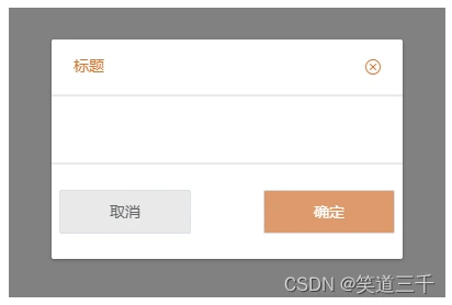
console.log("点击确定"); this.dialogshow = false; }, }, }; </script> <style></style> 效果:
版权声明:
本文来自互联网用户投稿,该文观点仅代表作者本人,不代表本站立场。本站仅提供信息存储空间服务,不拥有所有权,不承担相关法律责任。
如若内容造成侵权、违法违规、事实不符,请将相关资料发送至xkadmin@xkablog.com进行投诉反馈,一经查实,立即处理!
转载请注明出处,原文链接:https://www.xkablog.com/qdvuejs/10958.html